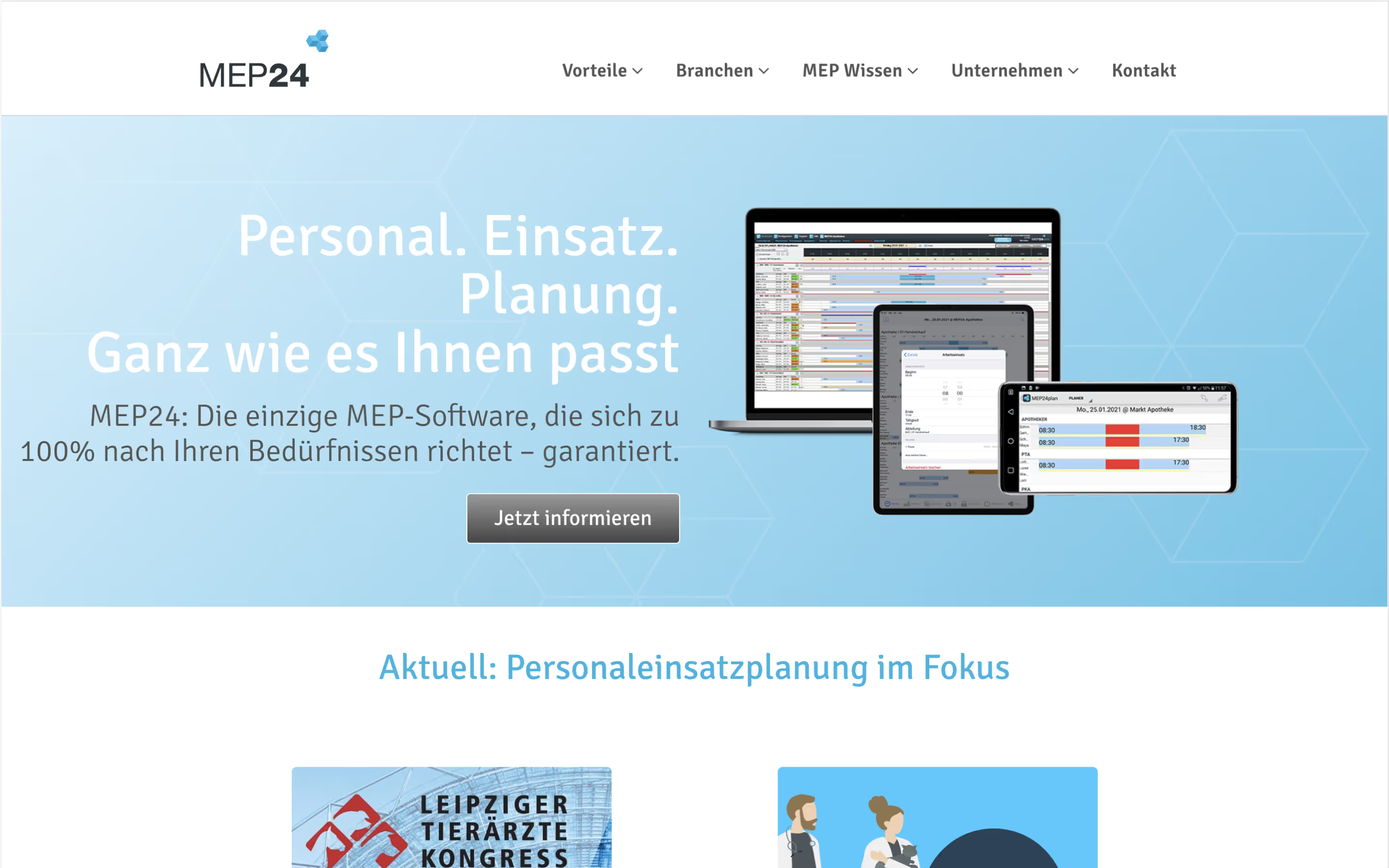

MEP24’s migration: Why they switched from WordPress to Webflow
Challenge
MEP24 is a deployment planning and time tracking software that was first launched in 1996. As the product improved and modernized across almost 30 years, its website grew out of date.
The team tried updating the website in parallel with the product. But with a complicated user interface, outdated design, and a bulky CMS, it was clear that WordPress was no longer working for MEP24.
They needed to migrate their website, and substantial blog, to a new platform.


The solution
MEP24’s team needed a fresh website that would be easy to edit when needed. They were ready to leave the clunky plug-ins and difficult user interface of WordPress behind. Webflow was the perfect solution.
First, I developed an organized website structure, modern new design, and custom visuals to replace the stock images. I also engaged a specialized copywriter to help the team better convey the product’s benefits and features.
Due to the size of the MEP24 blog and its existing traffic, we needed to take care when migrating the site so it wouldn’t lose rankings. We kept the same URL structures and took other precautions to maintain the site’s SEO profile.


Result
Our level of planning and customization resulted in a successful migration. The team was thrilled with their clean new structure and custom-built CMS that made site administration easier. They also felt that the new copywriting and visuals explained the software more effectively.
With a new and improved website, and Webflow-focused trainings, MEP24’s marketing team is now equipped to make their website work for them, long-term.
- Smooth website migration
- Easy-to-use CMS
- Intuitive site structure
- Modern design
- Custom visuals
"
Very pleasant collaboration - from design to project management, everything is state-of-the-art.
"

Scope
Strategy
Branding
Design
Development
CMS
Launch
Credits
Need a new website?
I specialize in Webflow sites for tech companies from startups to enterprises.

